.png)

Context: HCDE 418 (Advanced Projects in HCDE)
Duration: 10 weeks (Spring 2020)
Collaboration: Team of 4
Skills Demonstrated: Ability to solve complex problems using user centered design and think critically about stakeholder values
Tools Used: Figma
As a team of HCDE undergrads, we set out to propose a well-defined addition to the Virtual Coordination Center (VCC) startup to encourage stakeholder buy in. The complications behind resource management stood out to us as we found that a lack of awareness of resource need can cause incident response delays.
After ideating with several divergent ideas, we converged on three VCC components that address this lag. These components enhance situational awareness of resource need and use, reduce incident lag, and integrate well into current VCC designs.
Our professor and TA have worked closely with a startup called the VCC, aiming to foster collaboration between Seattle’s many traffic and transit agencies. The VCC is a cloud-based desktop application that connects Washington State Department of Transportation (WSDOT), Seattle Department of Transportation (SDOT), Seattle Fire Department (SFD), Seattle Police Department (SPD), King Country Metro (KCM) and Washington State Patrol (WSP), with the goal of increasing communication and reducing incident response time. Their current challenge with the VCC is encouraging stakeholders to invest in the project because the proposed deliverables have been ambiguous.


Logos of all participating agencies in the VCC startup.
Thus, the goal of each team of four was to produce a well-defined product that extended off the VCC. Because our projects could take so many different forms, how we got from point A to point B was up to us. My team and I created the following milestones to keep us on schedule.

The milestones my group and I set for ourselves to ensure we stayed on track. Click to enlarge.
Multiple stakeholders had come in to speak to our class already, so we had a broad knowledge of the challenges in incident and congestion management. One of the stakeholders used the term “resource injections” while describing how an incident was managed, and my team and I were intrigued. Thus, our how might we that guided our interview plan was:

In building this baseline understanding, we defined resources as traffic control equipment and personnel (variable message signs, cones, flaggers, etc.).
True to our first milestone, my team and I started with an interview plan. We planned to conduct two interviews with WSDOT and SPD to investigate our how might we question. We asked questions in five general categories: resources, jurisdiction, inter-agency collaboration, communication, and decision making.
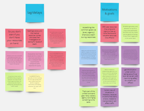
In our transcribed interviews we compiled important tidbits into the five general categories we investigated. Then, we imported each tidbit into Miro on a sticky note that represented that tidbits’ category. As a team we started arranging our tidbits into themes.

The end result of theming. Click to enlarge.
Extracting key research insights led to the discovery of pain points in the current resource workflow.
.png)
.png)
From these pain points, we made design requirements that centered around allowing for iterative growth, decreasing lag, and increasing situational awareness. With a better understanding of the current resource workflows, my team and I felt the need to refine our how might we. Thus, our new design question was:

Because resource decisions are made by dispatchers and higher-level officers, those responders became our intended users. We summarized all of our work thus far in a progress summary that we gave to our professor.
To determine a system that best fit our design requirements and had the most potential to reduce lag, we did individual ideation that focused on divergent ideas. My ideas are below, and include a resource map, resource management system, and a debrief prompter.

.png)
.png)
My individual ideation sketches, with notes to the side.
After sharing our ideas and making a pros and cons list for each, we combined multiple of our favorite ideas together into the first low-fidelity sketches of our system. After discussing user permissions, barriers to implementation and ease of use, we converged on three components: the Situation Map, the Collaboration Spaces, and the Resources Tab (which has both the action center and database).
Situation Map
The Situation Map component already exists in current VCC wireframes and gives a high-level understanding of whatever layers the map has toggled on. We saw value in adding a resource layer to this map to increase situational awareness and show all the resources being used across Seattle, not just the ones per incident.

Our low-fidelity sketch of the situation map resources layer. Click to enlarge.
Collaboration Spaces
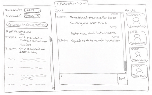
The Collaboration Spaces component also already exists in the VCC wireframes. However, we redesigned this tab to scale the functionality of the current design to more people and more conversations—including those concerning resources.

Our low-fidelity sketch of the redesigned collaboration space. Click to enlarge.
Resources Tab - Action Center
The Resources Tab is the largest addition and includes both the resource action center and the resource database. The resource action center is where a user can add resources, request them, and see which agency has fulfilled those requests.

Our low-fidelity sketch of the resource action center. Click to enlarge.
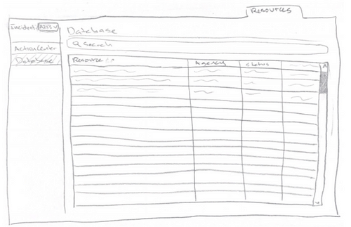
Resources Tab - Database
The resource database is a static inventory of all the resources available between agencies and is used to provide inexperienced officers a chance to increase their familiarity with what is available to them during a response.

Our low-fidelity sketch of the resource database. Click to enlarge.
Although the details and design of the system still needed to be ironed out and tested against user workflows, the structure was decided. This system does not cut out any communication channels that exist currently, nor the relationships that responders can create through those conversations.
With the main structure of our idea intact, we refined design, micro interactions, and product feasibility with the help of regular critique from our professors.
Our vision was that these proposed features would lead to a future where resources from all agencies in the VCC are integrated and eventually where partnerships with private agencies can be effectively leveraged as a part of this system.
Situation Map
The Situation Map tab provides an overview of all incidents and relevant information on the landing page of the VCC. With the resource layer toggled, hovering over the cone icons on the screen shows a list of resources currently at each scene.

Hi-fidelity mockup of what the situation map would look like with the resources layer toggled on. Click to enlarge.
Collaboration Spaces
The Collaboration Spaces tab facilitates conversations about mobilizing resources and any additional communication. A blue “Fulfill” button is displayed next to every resource request that populates from the action center. Because we did not want resources to be fulfilled by mistake, we implemented a double click interaction (turns to “confirm” after the first click) to ensure promising to fulfill a resource was an intentional action.

Hi-fidelity mockup of the Collaboration Spaces tab with example conversations. Click to enlarge.
Resources Tab - Action Center
The action center is the area under the resources tab where a user can request resources. When a user adds a resource to "Active Requests," a request for that item is sent out in the collaboration center. This process keeps all agencies in the loop about what is needed and what has already been mobilized.
.jpg)
Hi-fidelity mockup of the Resources tab’s action center. Click to enlarge.
The same double click interaction happens when moving a resource from the “Active Requests” to “Fulfilling.” Because fulfilling a resource is not taken lightly, responders are only able to promise resources for their own agency.

A gif showing the microinteraction of double clicking to confirm fulfilling a resource.
The other microinteraction we focused on was that of canceling resource fulfillment. That action carries a lot of weight because it can bottleneck the response, so we implemented a warning upon clicking the “x”.

A gif showing the microinteraction of unfulfilling a resource.
Resources Tab - Database
Lastly, the database is the area under the resources tab that catalogs all cross-agency resources. Its content is used to populate the Action Center and Collaboration Spaces during an incident. Setting up this database only requires importing a CSV file of an agency’s resources—something that each agency already has.

Hi-fidelity mockup of the Resources tab’s database. Click to enlarge.
More detailed wireframe annotations are here. To make sure our system was functioning the way we wanted it to for multiple incident types, we used example workflows and walked through how our system would be used. In every case, fulfilling resources was a collaborative effort directed at all agencies instead of just the responsibility of the agency in charge of the incident. We believe this will get resources to the scene quicker and reduce incident lag.
Although creating hi-fidelity mockups was the final stage in our design, it was not our final project deliverable. To present our product to the VCC, we created a formal proposal that outlined the justification for our product, the added value, and steps to implementation.
Overall, my team and I were happy with the deliverable we put forward. We liked how our product was feasible and could be implemented with little effort. That said, there were some things we wished we could have time to solve. In the future, continued development on these designs could involve the creation of a system to track accurate counts of available resources. We recognized that the barrier of implementation and maintenance involved with inventorying resources was too large for the scope of our project.
Additionally, the politics around sharing resources was a potentially complex issue that is important to consider. We ultimately decided that this topic was not within the scope of our current design, but our research indicated that preexisting resource agreements may effectively facilitate these sharing relationships.
Working over zoom was challenging, especially during ideation when we all wanted to whiteboard together. However, we found collaborative software and ways to make it through!

My team and I working over zoom!
This class functioned like a real company, and as a result I got a taste of what UX work can look like outside of a structured class or internship program. I appreciated the ability to set our own milestones and liked the freedom my group and I were given to pick a topic and explore it. My ability to handle complexity has grown significantly, and I feel less intimidated by equally complex problems I see around me.
.png)